Table
The Table component is a flexible and customizable table designed for displaying sortable data.
Features
- Sorting: Click on any column header to sort the table by that column. Sorting toggles between ascending, descending, and unsorted states.
- Multi-Column Sorting: Multi-column sorting allows you to sort data by multiple columns. Click additional column headers in the desired order of sorting priority.
- Pagination: Use the pagination controls below the table to navigate through multiple pages of data. You can move between the first, previous, next, and last page. You can also see the current page number and total pages.
- Custom Rendering: Certain columns (like image and price) use custom render functions to display data in a more user-friendly way.
How to Use the <Table> Component
To use the <Table> component, pass the required data, columns, and paginationOptions as props. Additionally, you can use props like striped, bordered, and others to customize its appearance, as inherited from the Trussworks Table component.
For a practical implementation, refer to the Simple Table Example.
Props
<Table> Props
| Prop Name | Type | Description |
|---|---|---|
data | Array<Object> | The array of objects representing your table's data. Each object should have keys matching the key values in columns. |
columns | Array<Object> | Defines the structure and configuration of the table columns. |
paginationOptions | Object | Provides options for handling pagination, such as pageSize, currentPage, totalRows, and onPageChange. |
onRowClick | function | A callback function triggered when a table row is clicked. |
defaultSort | Array<Object> | Sets the default sorting for the table, with each object specifying a key for the column and direction ("asc" or "desc"). |
className | string | An optional className for custom styling. |
Trussworks Table Props
The <Table> component is built on top of the Trussworks table component, allowing you to pass Trussworks-specific props like striped, bordered, and others for additional customization.
For more details on available Trussworks props, refer to the Trussworks Table Documentation.
Columns Object Properties
| Property | Type | Description |
|---|---|---|
key | string | The key used to access the data value for this column. |
label | string | The display name of the column header. |
sortable | boolean | If true, the column is sortable. |
render | function | (Optional) A function that returns a JSX element to customize how the column data is rendered. |
className | string | (Optional) A custom className for additional styling of individual columns. |
hidden | boolean | If true, the column will be hidden from table. |
Pagination Options Object Properties
| Property | Type | Description |
|---|---|---|
pageSize | number | The number of rows to display per page. |
currentPage | number | The current page being displayed (starts from 1). |
totalRows | number | The total number of rows in the dataset. |
onPageChange | function | Callback function triggered when the page changes. It provides the new page index as an argument. |
Usage Examples
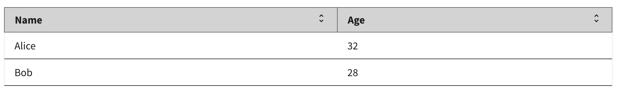
Simple
This example shows a simple table, with two columns and two rows.
import { Table } from "@nmfs-radfish/react-radfish";

<Table
  data={[
    { id: 1, name: "Alice", age: 32 },
    { id: 2, name: "Bob", age: 28 },
  ]}
  columns={[
    { key: "name", label: "Name", sortable: true },
    { key: "age", label: "Age", sortable: true, hidden: false },
  ]}
/>
This code will render as shown in this screenshot:
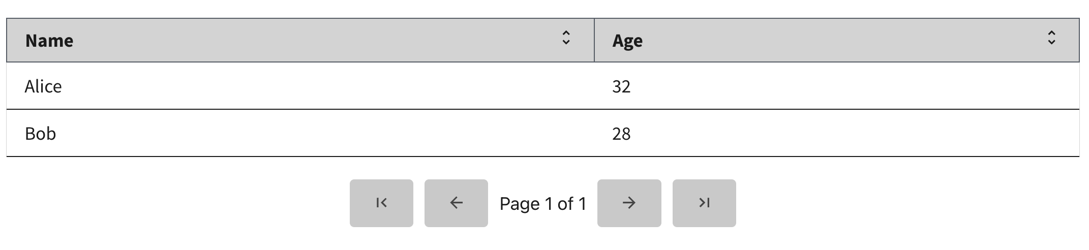
Pagination
This example shows a table with multiple pages by using paginationOptions.
import { Table } from "@nmfs-radfish/react-radfish";

<Table
  data={[
    { id: 1, name: "Alice", age: 32 },
    { id: 2, name: "Bob", age: 28 },
  ]}
  columns={[
    { key: "name", label: "Name", sortable: true },
    { key: "age", label: "Age", sortable: true, hidden: false },
  ]}
  paginationOptions={{
    pageSize: 5,
    currentPage: 1,
    onPageChange: (newPage) => console.log(`Page changed to ${newPage}`),
  }}
/>
This code will render as shown in this screenshot:
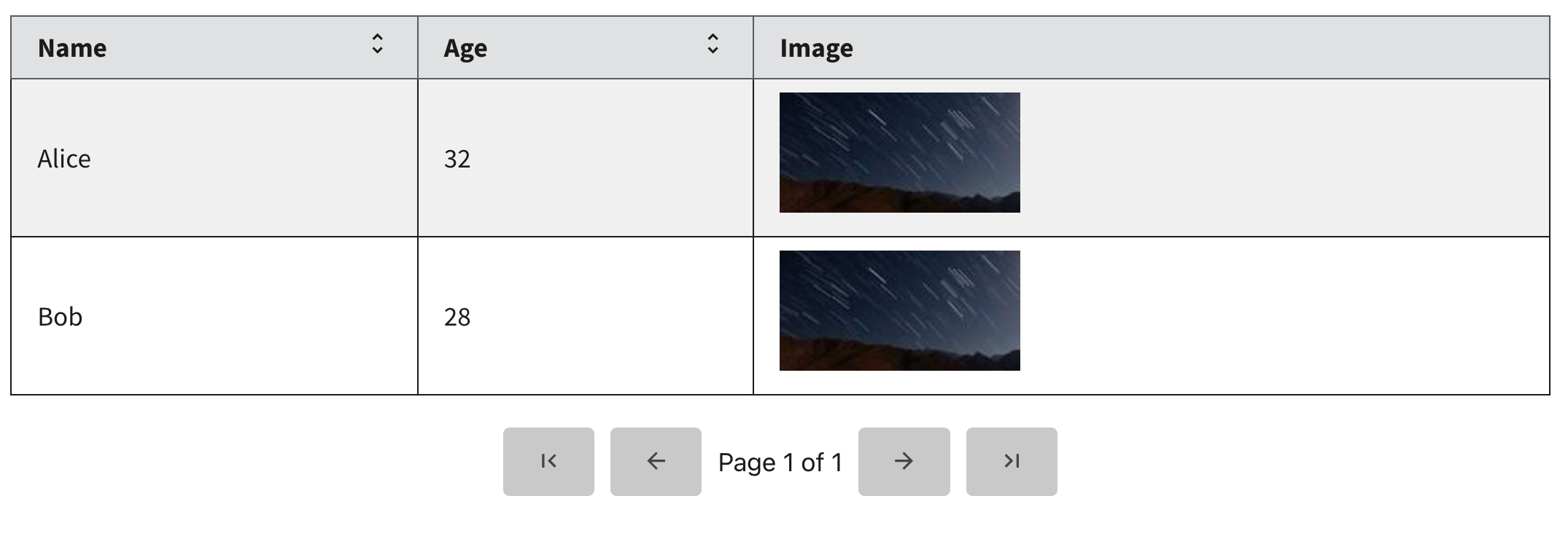
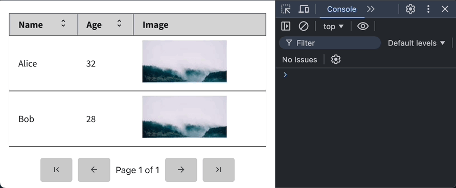
Column Render Property
Certain data types, such as images, require special rendering properties.
<Table
  data={[
    { id: 1, name: "Alice", age: 32, image: "example-img.png" },
    { id: 2, name: "Bob", age: 28, image: "example-img.png" },
  ]}
  columns={[
    { key: "name", label: "Name", sortable: true },
    { key: "age", label: "Age", sortable: true, hidden: false },
    {
      key: "image",
      label: "Image",
      sortable: false,
      render: (row) => (
        <img src={row.image} alt={row.species} height={75} width={150} />
      ),
    },
  ]}
  paginationOptions={{
    pageSize: 5,
    currentPage: 1,
    onPageChange: (newPage) => console.log(`Page changed to ${newPage}`),
  }}
/>
This code will render as shown in this screenshot:
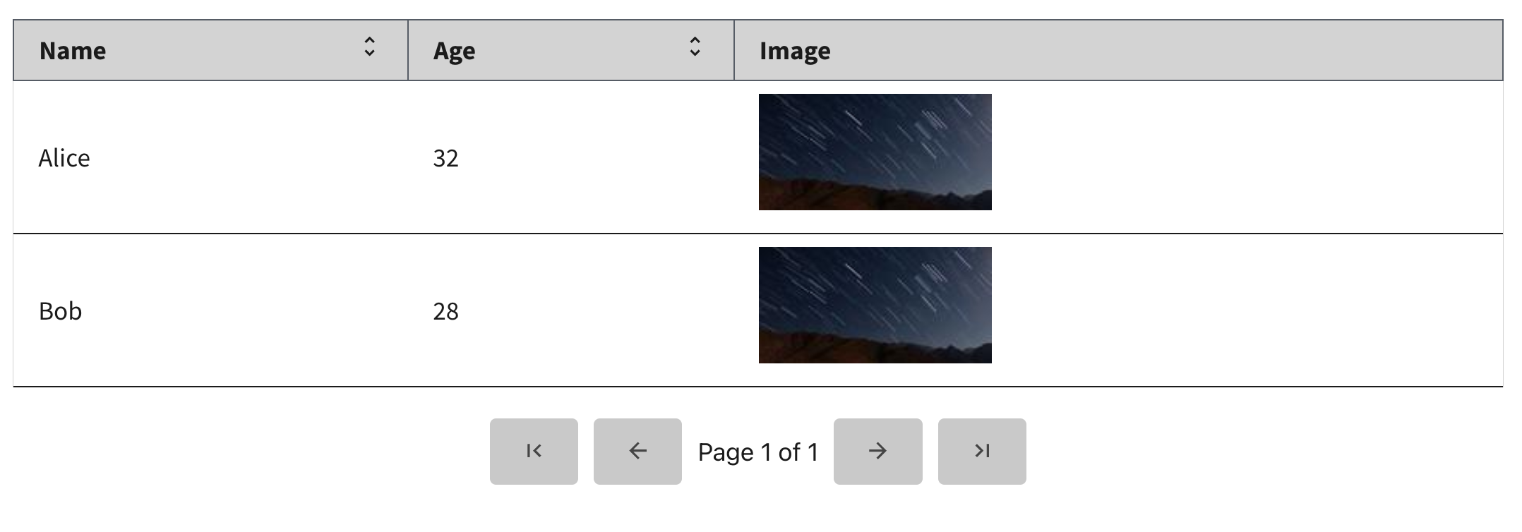
onRowClick Prop
You can use onRowClick to pass functions using React.
<Table
  data={[
    { id: 1, name: "Alice", age: 32, image: "example-img.png" },
    { id: 2, name: "Bob", age: 28, image: "example-img.png" },
  ]}
  columns={[
    { key: "name", label: "Name", sortable: true },
    { key: "age", label: "Age", sortable: true, hidden: false },
    {
      key: "image",
      label: "Image",
      sortable: false,
      render: (row) => (
        <img src={row.image} alt={row.species} height={75} width={150} />
      ),
    },
  ]}
  paginationOptions={{
    pageSize: 5,
    currentPage: 1,
    onPageChange: (newPage) => console.log(`Page changed to ${newPage}`),
  }}
  onRowClick={(row) => {
    console.log("Row clicked:", row);
  }}
/>
This code will render as shown in this animated gif:
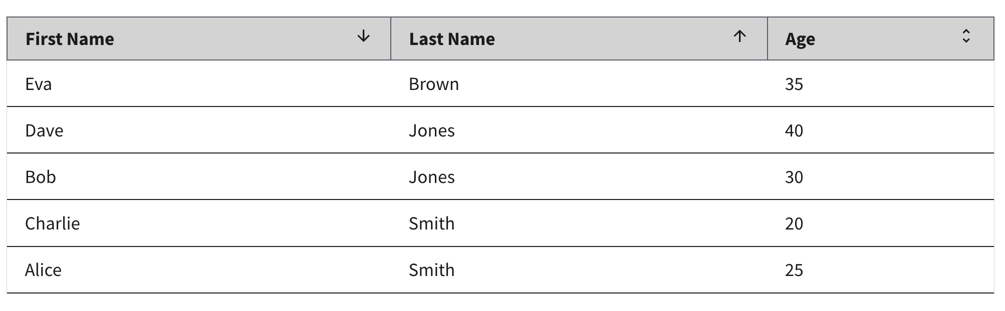
defaultSort Prop
You can set how the table is displayed by default.
<Table
  data={[
    { id: 1, firstName: "Alice", lastName: "Smith", age: 25 },
    { id: 2, firstName: "Bob", lastName: "Jones", age: 30 },
    { id: 3, firstName: "Charlie", lastName: "Smith", age: 20 },
    { id: 4, firstName: "Dave", lastName: "Jones", age: 40 },
    { id: 5, firstName: "Eva", lastName: "Brown", age: 35 },
  ]}
  columns={[
    { key: "firstName", label: "First Name", sortable: true },
    { key: "lastName", label: "Last Name", sortable: true },
    { key: "age", label: "Age", sortable: true },
  ]}
  defaultSort={[
    { key: "lastName", direction: "asc" },
    { key: "firstName", direction: "desc" },
  ]}
/>
This code will render as shown in this screenshot:
Trussworks Table Props
You can add styles like bordered or striped to your table.
<Table
  data={[
    { id: 1, name: "Alice", age: 32, image: "example-img.png" },
    { id: 2, name: "Bob", age: 28, image: "example-img.png" },
  ]}
  columns={[
    { key: "name", label: "Name", sortable: true },
    { key: "age", label: "Age", sortable: true, hidden: false },
    {
      key: "image",
      label: "Image",
      sortable: false,
      render: (row) => (
        <img src={row.image} alt={row.species} height={75} width={150} />
      ),
    },
  ]}
  paginationOptions={{
    pageSize: 5,
    currentPage: 1,
    onPageChange: (newPage) => console.log(`Page changed to ${newPage}`),
  }}
  bordered
  striped
/>
This code will render as shown in this animated gif: