Form Structure Example
This example shows you how to build a non-trivial form. It uses core components provided by Trussworks react-uswds. It is not intended to show a full form implementation, such as sending a request on submit.
Learn more about RADFish examples at the official documentation. Refer to the RADFish GitHub repo for more information and code samples.
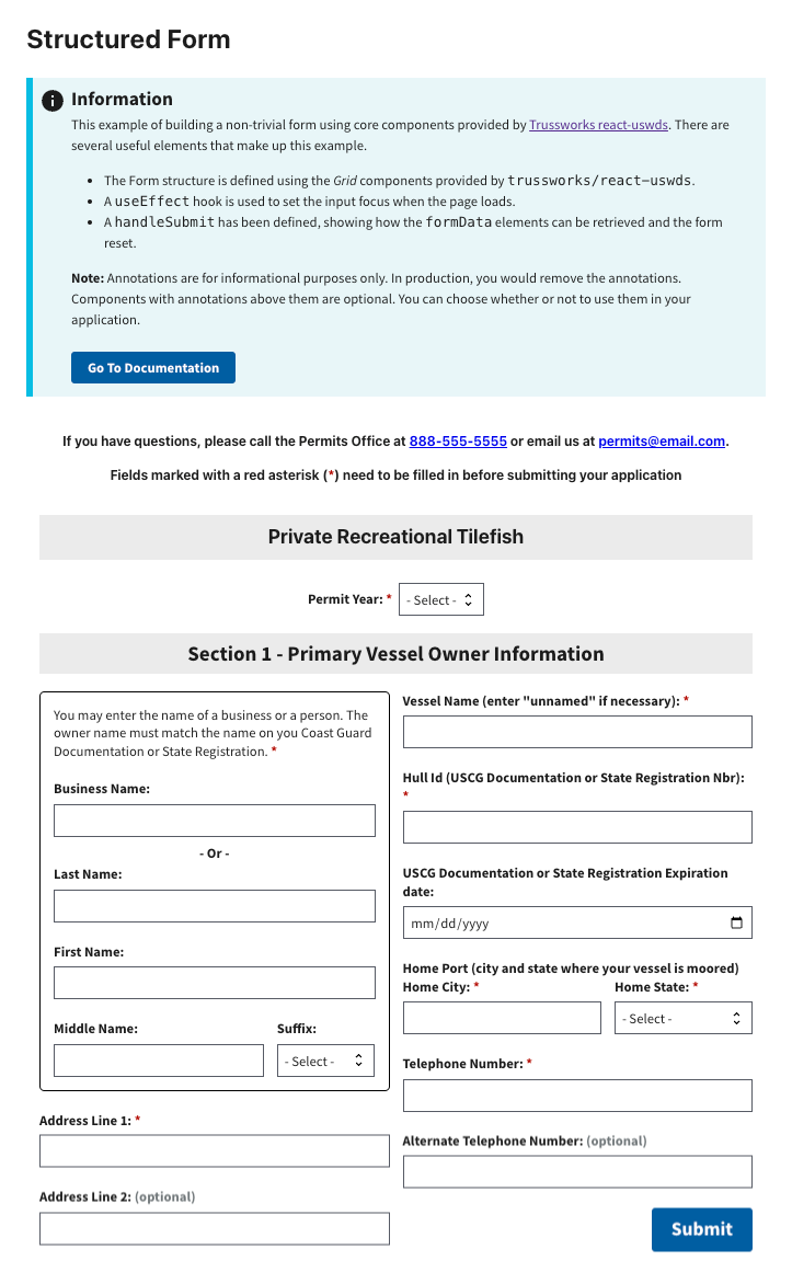
Preview
This example will render as shown in this screenshot:
Steps
1. Define the Page Structure
Use Trussworks Grid components to define the layout of your page in src/pages/Home.jsx. This approach helps organize content while maintaining a clean and responsive design.
Page structure with a single column:
<GridContainer>
    <Grid row>
        <Grid col>
            <p className="text-bold text-center">
                Private Recreational Tilefish
            </p>
        </Grid>
    </Grid>
</GridContainer>
Aligning two inputs in a single row:
To place two input components side by side, use the Grid components. The gap property adds spacing between columns.
<Grid row gap>
    <Grid col={8}>
        <Label htmlFor="middle-name" className="text-bold">Middle Name:</Label>
        <TextInput id="middle-name" name="middleName" />
    </Grid>
    <Grid col={4}>
        <Label htmlFor="suffix-select" className="text-bold"> Suffix: </Label>
        <Select id="suffix-select" name="suffixSelect" />
    </Grid>
</Grid>
2. Applying CSS Styles with classNames
For customized layout and styling, you can apply CSS through several approaches. Add CSS through component props, USWDS utility classes, and custom CSS classes.
Using Component Props
Many Trussworks components support built-in props for styling. For instance, the gap prop can control spacing between grid elements:
<Grid row gap="md">
    {/* Content here */}
</Grid>
Using USWDS Utility Classes
Apply predefined USWDS utility classes to quickly style components without custom CSS:
<Grid row className="flex-justify-center">
    {/* Content here */}
</Grid>
Using Custom CSS Classes
For advanced or project-specific styles, define custom CSS classes and apply them using the className attribute:
<div className="app-input-boundary">
    {/* Content here */}
</div>
3. Setting Focus on Load and Reset
To enhance usability, the form sets focus on a specific input field both when the form loads and after it resets. To achieve this, use the useRef hook and React's useEffect to programmatically focus on the desired field.
const inputFocus = useRef(null);

useEffect(() => {
    if (inputFocus.current) {
        inputFocus.current.focus(); // Set focus on the input field
    }
    setResetToggle(false); // Reset the toggle state
}, [resetToggle]);

<Select
    id="permit-year-select"
    name="permitYear"
    inputRef={inputFocus} //Attach the ref to the input field
/>
4. Display FormData Values on Submit and Reset the Form
When the form is submitted, the values of all fields are displayed, and the form is reset. This ensures that users receive feedback on their input. And, the form state is cleared for a new submission.
const handleSubmit = (event) => {
    event.preventDefault();
    const formData = new FormData(event.target);
    const values = {};
    let alertString = '';

    for (const [key, value] of formData.entries()) {
        values[key] = value;
        alertString += `${key}: ${value}\n`;
    }

    window.alert(alertString);
    // Reset for after triggering Submit
    event.target.reset();
    // Set focus on first input after form is submitted.
    setResetToggle(true);
};