Simple Table Example
This example shows you how to use the <Table> component to display tabular data.
Learn more about RADFish examples at the official documentation. Refer to the RADFish GitHub repo for more information and code samples.
Table Overview
The <Table> component is flexible and customizable. It lets you define column configurations, enable sorting, and paginate large datasets. In this example, we use mock data representing different fish species with attributes such as status (draft/submitted), UUID, species name, image, and price.
Features
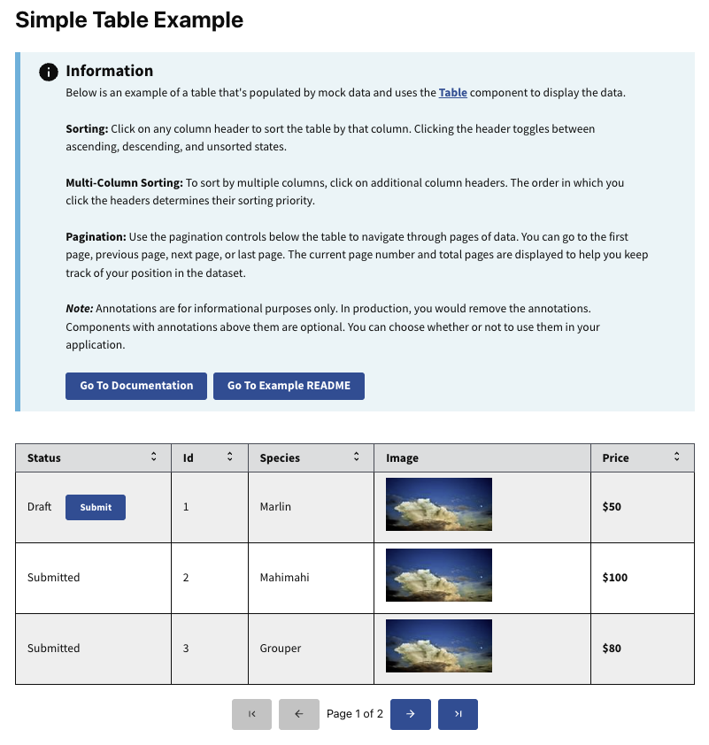
- Sorting: Click on any column header to sort the table by that column. Sorting toggles between ascending, descending, and unsorted states.
- Multi-Column Sorting: Multi-column sorting allows you to sort data by multiple columns. Click additional column headers in the desired order of sorting priority.
- Pagination: Use the pagination controls below the table to navigate through multiple pages of data. You can move between the first, previous, next, and last page, and see the current page number and total pages.
- Custom Rendering: Certain columns (like the image and price) use custom render functions to display data in a more user-friendly way.
- Status Submission: Rows with a "Draft" status display a "Submit" button, which updates the status to "Submitted" when clicked.
Preview
This example will render as shown in this screenshot:
Steps
1. Data Structure
The data prop is an array of objects where each object represents a row in the table. Each object should have keys that correspond to the key values defined in your columns array.
const mockData = [
    {
        uuid: "1",
        isDraft: true,
        species: "Marlin",
        price: 50,
        image: "./sample-img.webp",
    },
    {
        uuid: "2",
        isDraft: false,
        species: "Mahimahi",
        price: 100,
        image: "./sample-img.webp",
    },
    // More data...
];
2. Columns Configuration
The columns array defines how the table displays and interacts with the data. Each column object can include:
key: (string) A unique identifier that matches a key in your data object.label: (string) The header text displayed for the column.sortable: (boolean) A boolean that determines whether sorting is enabled for this column.render: (function) (Optional) A function that customizes how data is displayed in that column.className: (string) (Optional) For custom styling.
const columns = [
    {
        key: "isDraft",
        label: "Status",
        sortable: true,
        render: (row) => (
            <span>
                {row.isDraft ? "Draft" : "Submitted"}
                {row.isDraft && <Button onClick={(e) => handleSubmit(e, row)}>Submit</Button>}
            </span>
        ),
    },
    {
        key: "uuid",
        label: "ID",
        sortable: true,
    },
    {
        key: "species",
        label: "Species",
        sortable: true,
    },
    {
        key: "price",
        label: "Price",
        sortable: true,
        render: (row) => <strong>${row.price}</strong>,
    },
    {
        key: "image",
        label: "Image",
        render: (row) => <img src={row.image} alt={row.species} height={75} width={150} />,
    },
];
3. Custom Rendering with render
Use the render function to customize how data is displayed in a column. This is useful for rendering components like buttons or images.
-
Rendering a Button:
{
    key: "isDraft",
    label: "Status",
    render: (row) => (
        <span>
            {row.isDraft ? "Draft" : "Submitted"}
            {row.isDraft && (
                <Button onClick={(e) => handleSubmit(e, row)}>
                    Submit
                </Button>
            )}
        </span>
    ),
}, -
Rendering an Image:
{
    key: "image",
    label: "Image",
    render: (row) => (
        <img src={row.image} alt={row.species} height={75} width={150} />
    ),
},
4. Pagination
Control table pagination using the paginationOptions prop.
Pagination Options:
pageSize: (number) Number of rows displayed per page.currentPage: (number) The current page number (starting from 1).totalRows: (number) Total number of rows in your dataset.onPageChange: (function) Function called when the page changes.
const paginationOptions = {
    pageSize: 5,
    currentPage: 1,
    onPageChange: onPageChange,
    totalRows: data.length,
};
5. Additional Props and Styling
Our <Table> component is built on the Trussworks <Table> component from the @trussworks/react-uswds library. This integration lets you use additional props to customize its appearance and behavior.
Using Trussworks Props
You can pass these props directly to the <Table> component to enhance its styling:
<Table
    data={data}
    columns={columns}
    paginationOptions={paginationOptions}
    className="my-custom-table"
    striped
    bordered
/>
Referencing Trussworks Documentation
For a complete list of available props and detailed descriptions, refer to the Trussworks Table Component Documentation.